
A straight line on a Weibull plot is not the end of the analysis. It is the point where interpreting the plot actually starts. Software hands you beta, eta and a correlation figure the moment the fit converges, and none of those three numbers says anything about whether the scatter behind them is even answerable as a single Weibull in the first place.
That gap matters because a Weibull plot carries far more information than the two parameters it eventually yields. The shape of the point scatter is a diagnostic instrument in its own right: a gentle curve says one thing, a sharp corner partway along says another, and a suspiciously perfect fit on a handful of points says a third. An engineer who reads only beta and eta off the printout is discarding most of what the plot was trying to tell them.
This page teaches that reading as a skill. It covers what each beta band implies about the mechanism behind it and what to do next in each case, why a correlation coefficient is a straightness test and not a validity test, a worked fleet that clears its fit statistic and is still wrong, and the small library of plot shapes every reliability engineer eventually has to recognise on sight.
What Beta Is Actually Telling You
Beta is the single most information-dense number a Weibull analysis returns, and reading it well means pairing the value with an action, not just a label.
The hazard rate for a two-parameter Weibull is h of t equals beta over eta, times t over eta, to the power beta minus one, and its shape is fixed entirely by β (Abernethy 2006). β < 1 means the hazard rate falls with age; β = 1 means it holds constant; β > 1 means the hazard rate rises with age, and everything below builds on that single fact.
- h of t
- the hazard rate at age t, the instantaneous risk of failure given survival to t
- beta
- the shape parameter, fitted as the slope of the Weibull plot
- eta
- the characteristic life, fitted at the 63.2% crossing
- t
- age, on the declared time base
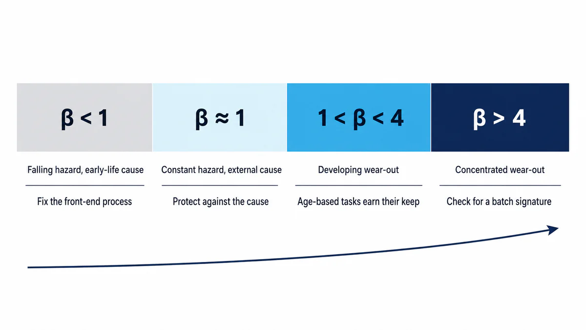
Four practical bands sit inside that shape, each pointing at a different next step:
| Beta range | What it typically indicates | What to do next |
|---|---|---|
| β < 1 | A falling hazard, consistent with an early-life cause: installation error, contamination at commissioning, an inadequate burn-in or a manufacturing defect surfacing under load | Fix the front-end process (installation practice, incoming inspection, commissioning test), not a shorter replacement interval. Replacing units earlier walks straight back into the same early-life risk. |
| β ≈ 1 | A roughly constant hazard, consistent with a time-independent external cause: random overload, impact damage, a foreign-object event | An age-based task achieves nothing here because the risk does not accumulate with age. Look at protecting against the external cause, or check whether a mixed population is masking a real pattern underneath the apparent constant rate. |
| 1 < β < 4 | A developing wear-out mechanism, hazard rising steadily with age | This is the regime where an age- or condition-based task starts to earn its keep, and where a cost-optimised replacement interval becomes a defensible calculation rather than a guess. |
| β > 4 | A concentrated wear-out mechanism operating in a narrow age band | Expected for some genuinely tight mechanisms; unexpectedly steep for a known mechanism is itself a flag, covered in the diagnostic library below. |
Treat these as diagnostic clues, not fixed physical laws. What matters is your own fitted β read alongside the failure-mode evidence, not a categorical rule applied from the band alone (Abernethy 2006).
A Correlation Coefficient Is Not a Verdict
The temptation with any fitted line is to look at one number and stop. On a Weibull plot, that number is r², and stopping there is the single most common mistake this page exists to correct.
Median rank regression fits a straight line to the transformed points X = ln(t) and Y = ln[ln(1/(1−MR))], and the strength of that fit is measured with the Pearson correlation coefficient:
- r
- the Pearson correlation coefficient between the transformed age and transformed probability, a number from −1 to +1
- X bar and Y bar
- the mean of the transformed age values and the mean of the transformed probability values
- r squared
- r squared, the coefficient of determination, read as the share of the transformed scatter the straight line accounts for
A high r² tells you the points sit close to a straight line. It does not tell you the data came from a single, clean Weibull population, and it is not the probability that the model is correct (Abernethy 2006). Data drawn from two pooled failure modes can still produce a respectably high r², because two straight-ish segments joined at an angle can look, to a bare correlation statistic, like one line with a bit of scatter. A high r² on mixed-mode data is a confident wrong answer, not a safe one.
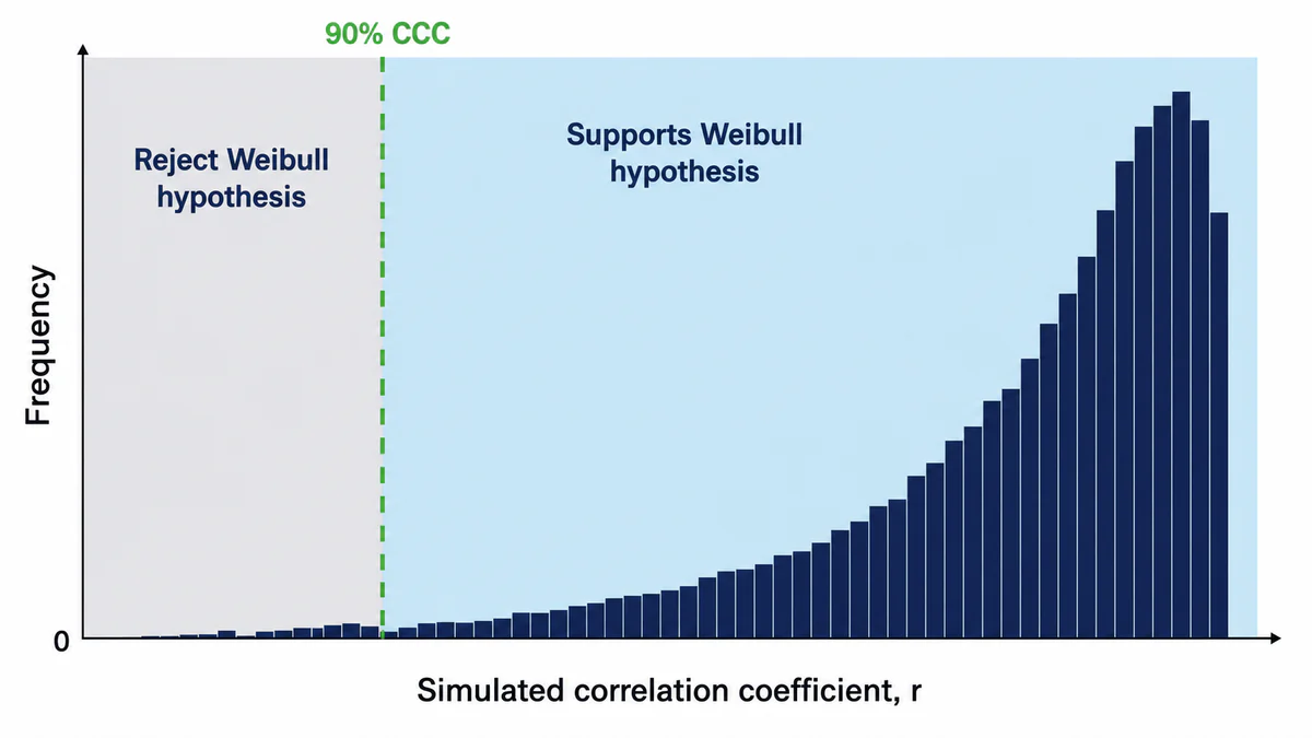
The fix is a threshold that adjusts to the sample size rather than a fixed number like "r above 0.9." Because median rank plotting positions are correlated with each other by construction, the raw sampling behaviour of r on genuinely Weibull data has to be established by simulation, a method Abernethy attributes to Monte Carlo work refined against thousands of simulated trials (Abernethy 2006). The logic runs in four steps:
Simulate several thousand samples of the same size as your data set, each drawn from an ideal Weibull population.
This builds the actual sampling distribution of r for a genuinely Weibull-distributed data set at that specific sample size, which is what the comparison needs.
Fit each simulated sample by median rank regression and record its r.
This produces thousands of "known good" r values to compare your one observed r against.
Sort the simulated r values and take the 10th percentile as the 90% critical correlation coefficient (CCC).
The 10th percentile marks the point below which only 10% of samples simulated from the assumed Weibull model would fall.
Compare your observed r to the CCC. At or above the threshold, the Weibull model is not rejected by this correlation screen at the 10% significance level; below it, the screen rejects the model.
This turns "does this look straight enough" into a stated, reproducible screening rule without claiming that a passing result proves the model is true.
Two things about the CCC surprise people the first time they see them. The threshold rises as the sample size grows, because a larger genuine Weibull sample is expected to sit tighter on the line than a small one, so the bar for "acceptable" gets harder to clear, not easier. And the threshold is set noticeably higher for a three-parameter fit than a two-parameter fit at the same sample size, specifically because the third parameter can inflate r² mechanically without the data actually behaving any better, a point that matters later in this page (Abernethy 2006).
A Fleet That Passes the Numbers and Fails the Eye
Here is the mechanism above, applied to data built specifically to show why the r²/CCC check is necessary but not sufficient on its own.
A fleet of 14 conveyor idler bearings comes back from the field for review: 12 failures and 2 units still in service, treated at first as one population because no one has separated them by cause yet.
| Age (hours) | Status | Median rank |
|---|---|---|
| 2,100 | Failure | 4.86% |
| 2,800 | Failure | 11.81% |
| 3,400 | Failure | 18.75% |
| 4,100 | Failure | 25.69% |
| 6,200 | Suspension | n/a |
| 14,200 | Failure | 33.33% |
| 16,800 | Failure | 40.97% |
| 19,500 | Failure | 48.61% |
| 21,200 | Failure | 56.25% |
| 23,600 | Failure | 63.89% |
| 26,100 | Failure | 71.53% |
| 28,400 | Failure | 79.17% |
| 31,000 | Failure | 86.81% |
| 33,500 | Suspension | n/a |
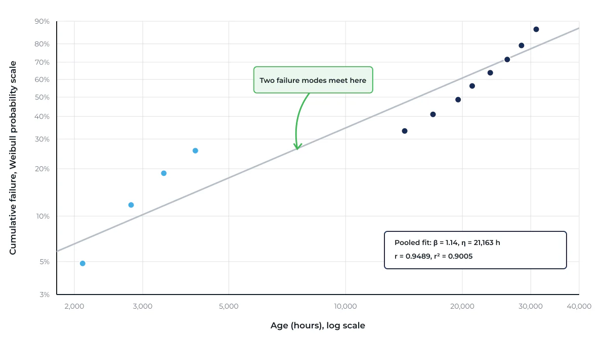
Ranks are adjusted for the two suspensions and converted with Benard's approximation exactly as set out in the previous page in this series; only the result is shown here (Abernethy 2006). Fitted as one population, this data set returns β = 1.14, η = 21,163 hours, r = 0.9489, r² = 0.9005. Run the CCC check from the previous section at n = 12 and the fit clears it: the Weibull model is not rejected by this correlation screen at the 10% significance level. That result does not prove the data comes from a single Weibull population.
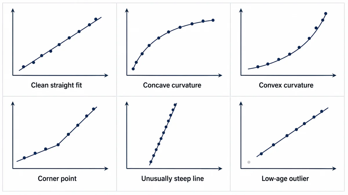
It is not one. Look at where the twelve points actually sit rather than only at the summary statistic, and a corner shows up: the four earliest points and the eight later points each hug their own local line, meeting at an obvious bend where the age gap between 4,100 and 14,200 hours falls. The r² is high enough to pass because two reasonably straight segments, stitched together, can still look fairly straight overall on a bare correlation test. This is what "a high r² on mixed-mode data is a confident wrong answer" looks like with real numbers attached to it, and it is exactly why the plot's shape, not the fit statistic alone, is what actually warns you.
One Failure Mode, One Weibull
The corner point in the section above is not a nuisance to fit around. It is the plot telling you the data needs to be split before it can be analysed at all.
Treat a corner point, dogleg or any other systematic departure from a straight line as a prompt to investigate, not a prompt to force a better fit.
A single Weibull describes one failure mechanism. Data generated by two mechanisms will never sit cleanly on one line, no matter how the fitting method is adjusted.
Pull physical evidence, teardown findings, maintenance records or inspection notes for the units on each side of the bend.
The plot shows you that a split is needed; it does not show you where the physical line between the two causes actually falls. That comes from evidence, not from picking a convenient age.
Separate the data by the mode the evidence supports, then refit each subgroup independently.
Each subgroup can now be tested against its own Weibull hypothesis, with its own beta describing one physical mechanism instead of an average of two.
Teardown records distinguish the four early contamination failures from the eight later fatigue failures. They do not, however, define how the two still-running units belong to those failure-mode populations. A defensible cause-specific refit would need all fourteen units classified under a declared competing-risk and right-censoring rule, with failures from the other mode handled explicitly rather than silently assigned or discarded.
Analysis boundary
Because that subgroup and censoring allocation is not supplied, separate beta, eta, correlation and CCC results are deliberately not reported here. The corner remains a valid diagnostic signal to investigate; it is not enough evidence to publish two fitted distributions.
This is the same discipline a well-run FMECA already applies at the failure-mode level: one line, one mode, one set of effects and causes, never a blended average of two failure stories under a single heading (IEC 60812:2018). A Weibull fitted across two failure modes is the statistical equivalent of an FMECA line that quietly covers two unrelated ways a component can fail, worth cross-checking in your failure mode register at the same time you separate the data.
The Rest of the Diagnostic Library
Three more plot signatures come up often enough to earn a place alongside the corner point, each with its own physical story and corrective action.
An unusually steep β, well beyond what the known mechanism should produce, is often a batch signature rather than a faster version of the same wear-out story: a bad supplier lot, a common installation error applied fleet-wide, or a process excursion during manufacture affecting every unit alike. Check serial numbers, production dates and installation records for clustering before accepting the steep slope as the mechanism's true behaviour.
Outliers at the low-age end, one or two points sitting well below the rest of the population's trend, are frequently a distinct early-life cause riding inside data that is otherwise a clean wear-out set, most often maintenance-induced damage during an unrelated intervention. Investigate that unit's history before deciding whether it belongs in the same analysis at all.
A fit that looks excellent on very few points deserves the least confidence, not the most. The contamination-mode fit above, r² = 0.9970 on only four failures, illustrates the trap directly: with so few points, a tight-looking line is at least as much a function of sample size as of genuine population behaviour, and the confidence bounds around that β and η stay wide even though the plotted line looks reassuring. Treat a beautiful fit on a handful of points as a reason to keep collecting data, not a reason to stop.
When the Plot Won't Give You a Clean Fit
Curvature that runs smoothly through the whole data set, rather than bending sharply at one point, is a different signal from a corner point, and it has its own corrective path.
Concave curvature on a standard two-parameter plot can suggest a positive location parameter, γ, meaning the mechanism genuinely has a failure-free period before any unit is at risk. Convex curvature can suggest the opposite, a negative γ or unrecorded early exposure the data collection missed. Either reading has to be tested, not assumed, because the two-parameter model has no way to represent a shifted origin on its own (Abernethy 2006).
Testing it properly means fitting the three-parameter form and checking whether the improvement is real, not just checking whether r² went up, because it almost always will. Refit the wear-out subgroup with a location parameter, and the best-fitting shift, γ ≈ 9,500 hours, lifts r² from 0.9878 to 0.9986, a gain of about one percentage point. That shift also asserts two-thirds of the age at the first observed failure was risk-free, with no teardown evidence or known physics of rolling-contact fatigue supporting a guarantee that large. The higher CCC bar applied to three-parameter fits exists precisely to catch this pattern: a mechanical gain from adding a parameter is not, by itself, a reason to believe it belongs in the model. Use γ when the mechanism justifies a failure-free period, not because it flatters the fit.
Sometimes none of this resolves into a clean single-mode plot, even after separating every mode the evidence supports. That is not a failed analysis. It is a legitimate finding: state the modes you can distinguish, state the ones you cannot yet separate for lack of evidence, and say plainly that a single defensible β and η are not available until better failure classification exists. A stated limitation is worth more than a forced number that looks tidy and is not defensible.
Reading the Plot Is the Actual Skill
Beta and eta are the output of a Weibull analysis. Reading the plot, the shape of the scatter, the fit statistic against a threshold that respects sample size, and the physical story each pattern points at, is the skill that makes those two numbers worth trusting. A fitted line that clears every check in this page tells you something real about a single failure mechanism. One that does not is telling you just as much, provided you read the shape and not only the slope.
The next page in this series moves from reading a fitted line to choosing how it gets fitted in the first place, setting median rank regression directly against maximum likelihood estimation and showing where each earns its place, along with how confidence bounds are built around either result.
If a fitted β and η from your own data has a shape that will not sit still on a clean line, or a fit statistic that looks better than the plot feels, we would be glad to work through it with you.
Start the conversation