
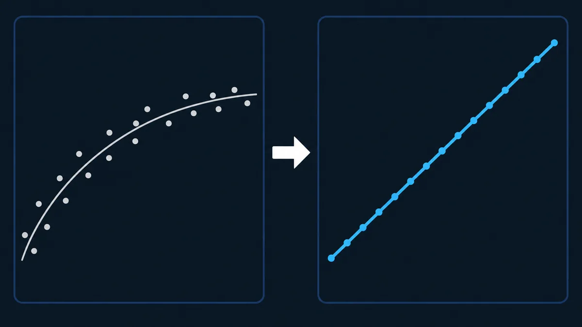
Feed a column of ages into any reliability software package and it returns β and η before the progress spinner has finished turning. What it does not return is any feel for where those two numbers came from, and an engineer who has never watched β and η fall out of a straight line has no way to sanity-check the output, spot a mixed failure mode from the shape of the residuals, or explain the result to anyone who asks how it was actually done.
This page works the classical method by hand, start to finish, on an original eleven-unit data set that includes suspensions: sorting, adjusting the ranks of units still running, converting those ranks to plotting positions, transforming the axes, and fitting a straight line to read β and η directly off it. Every intermediate number appears in the table below, so the whole method is reproducible from the table alone, on paper or in a spreadsheet.
The order below is deliberate. The transform comes first, because every step that follows it is bookkeeping in service of drawing one straight line correctly.
The Algebra That Makes Probability Paper Work
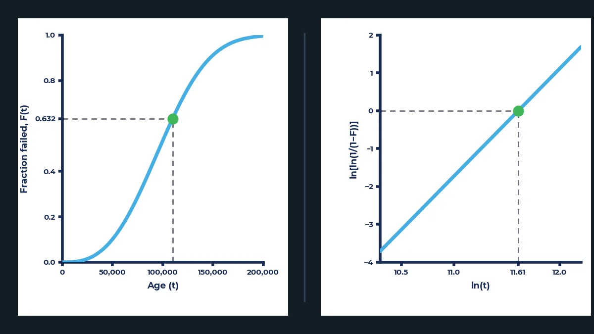
A Weibull probability plot is not a charting convention someone settled on by trial and error. It is one specific algebraic rearrangement, applied consistently, that turns a curved cumulative distribution into a straight line, and seeing the rearrangement once is what turns the method from a ritual into something you understand.
- F of t
- the fraction of the population failed by age t
- t
- age, on the declared time base (Life Data Fundamentals covers establishing this correctly)
- beta
- the shape parameter; on the transformed axes below it becomes the slope of a straight line
- eta
- the characteristic life; on the transformed axes below it fixes where that line sits
Set Y = ln{ln[1 / (1 − F(t))]} and X = ln(t). The last line above becomes Y = βX − β·ln(η), which is the equation of a straight line with slope β and intercept −β·ln(η) (Abernethy 2006). That is the entire mechanism behind Weibull probability paper: the vertical axis is not printed in ordinary percent, it is printed in the ln-ln transform of percent, and the horizontal axis is logarithmic. Build axes to those two rules, plot data from a genuinely Weibull-distributed population on them, and the points fall on a straight line. Every step from here is about getting the right numbers onto that line and reading it correctly once they are there. A reader who has followed the rearrangement above can look at any Weibull plot, printed or on screen, and know exactly what physical quantity each axis represents, which is not something a reader who has only ever pressed a button labelled “plot” can claim.
The Method, Step by Step
Eight steps take a column of raw ages to a fitted β and η. Each one earns its place in the order given; skip the reasoning behind any of them and the fitted line stops being trustworthy even if the arithmetic still runs.
Confirm one failure mode and a single time base before ranking anything.
A rank order built across two failure modes or two time bases cannot be untangled later, and every downstream number inherits the error; Life Data Fundamentals covers how to make both decisions correctly before this method ever starts.
Sort every unit, failures and suspensions together, by ascending age.
Rank order is the entire input to the adjustment in Step 4, so the sort must include every observation, not the failures alone, or the ranks that follow will be counting the wrong population.
Assign each unit a reverse rank, counting down from N at the earliest age to 1 at the latest.
The reverse rank measures how many units, including the one being ranked, were still exposed to risk at that age, which is exactly what the adjustment in the next step needs as its input.
Compute an adjusted rank for every failure with the Auth formula, carrying each result forward as the previous adjusted rank for the next.
A suspension removes a unit from future risk without it ever failing, and the adjustment spreads the survival information that unit was carrying across the failures that come after it, a technique that traces back to the original hand-plotting literature (Abernethy 2006; Weibull Analysis Handbook).
Convert each failure's adjusted rank to a median rank using Benard's approximation.
The adjusted rank is a position in a sequence; the median rank turns that position into the cumulative failure percentage the plot actually needs on its vertical axis.
Plot failures only, at their (age, median rank) coordinates. Never plot a suspension as a point.
A suspension has no failure age to plot, and its contribution to the analysis is already embedded inside the adjusted ranks of the failures around it.
Fit the transformed points with a stated regression direction, life as the dependent variable and transformed probability as the independent one.
The fit direction is a declared convention, not an arbitrary choice, and changing it changes the answer; stating it is what makes the result reproducible from the same data.
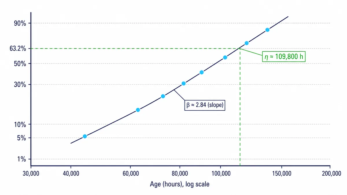
Read β directly as the fitted slope, and η as the age where the fitted line crosses 63.2% cumulative failure.
Both facts follow straight from the algebra in the first section, so no separate calculation is needed once the line itself is fitted correctly.
Applying It: An Eleven-Bushing Fleet
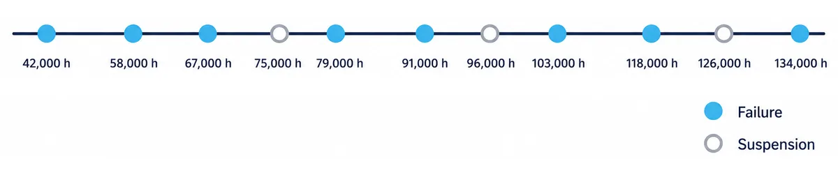
The method above is abstract until it runs on real numbers. Here it is applied to an original fleet: eleven medium-voltage transformer bushings, tracked in service hours, with dielectric (insulation) degradation as the target failure mode and one shared time base throughout.
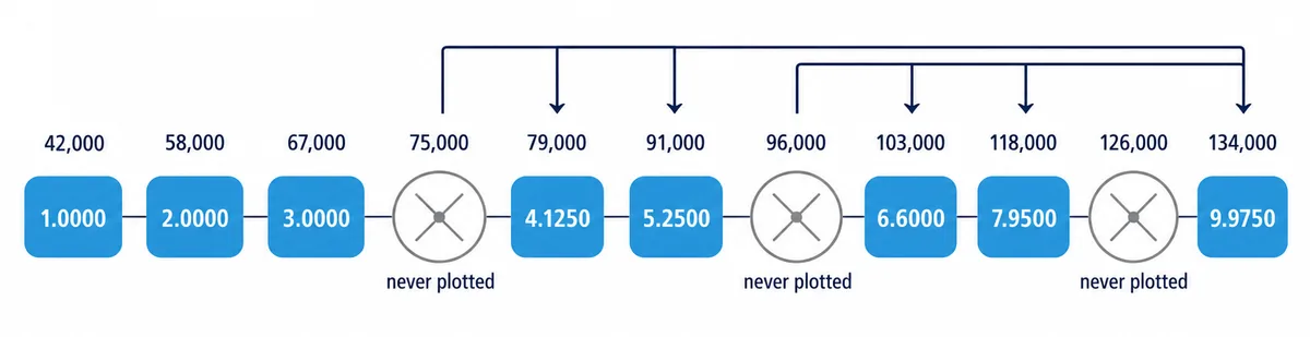
Eight bushings failed from that mode; three were still in service when the data was pulled and are suspensions, carrying real information about survival even though none of them will appear as a plotted point. Sorting all eleven by age and stepping through Steps 2 to 5 above produces the table below, with every reverse rank and adjusted rank shown so the result can be checked column by column against the formulas.
| Age (hours) | Status | Reverse rank | Adjusted rank | Median rank |
|---|---|---|---|---|
| 42,000 | Failure | 11 | 1.0000 | 6.14% |
| 58,000 | Failure | 10 | 2.0000 | 14.91% |
| 67,000 | Failure | 9 | 3.0000 | 23.68% |
| 75,000 | Suspension | 8 | n/a | n/a |
| 79,000 | Failure | 7 | 4.1250 | 33.55% |
| 91,000 | Failure | 6 | 5.2500 | 43.42% |
| 96,000 | Suspension | 5 | n/a | n/a |
| 103,000 | Failure | 4 | 6.6000 | 55.26% |
| 118,000 | Failure | 3 | 7.9500 | 67.11% |
| 126,000 | Suspension | 2 | n/a | n/a |
| 134,000 | Failure | 1 | 9.9750 | 84.87% |
Follow the adjusted rank column and the mechanism in Step 4 becomes concrete rather than abstract. The first three failures, all younger than any suspension in the fleet, keep the adjusted ranks 1, 2 and 3 that a simple failure count would have given them anyway. The suspension at 75,000 hours changes nothing about those three, because it occurs after them, but every failure from 79,000 hours onward inherits an adjusted rank noticeably larger than its raw position in the failure-only sequence, because the Auth formula spreads the survival evidence that suspended unit was carrying across the failures still ahead of it in age (Abernethy 2006). Two further suspensions, at 96,000 and 126,000 hours, repeat that widening again, which is why the last failure at 134,000 hours carries an adjusted rank of 9.975 rather than the 8 it would have received had the three suspended units simply been deleted from the data set.
The three suspensions in this fleet arose the way most do in practice, not from anything exotic. Two bushings were still in continuous service, carrying no dielectric fault at all, when the data was pulled for analysis. The third was removed intact during an unrelated transformer retrofit, before it had any chance to fail from any cause. None of the three tells you when, or even whether, that unit would eventually have failed from insulation degradation, and that is exactly why none of them is plotted as a point, while all three still count fully in the ranks that shape where the plotted points land.
Fitting the Line and Reading Beta and Eta
With eight median ranks in hand, transforming the axes and fitting the line is two lines of arithmetic. Reading the result correctly is where the whole method pays off.
| Age (hours) | X = ln{ln[1/(1−MR)]} | Y = ln(age) |
|---|---|---|
| 42,000 | −2.7588 | 10.6454 |
| 58,000 | −1.8233 | 10.9682 |
| 67,000 | −1.3083 | 11.1124 |
| 79,000 | −0.8946 | 11.2772 |
| 91,000 | −0.5629 | 11.4186 |
| 103,000 | −0.2177 | 11.5425 |
| 118,000 | 0.1060 | 11.6784 |
| 134,000 | 0.6357 | 11.8056 |
β above 1 means the hazard rate rises with age, consistent with a genuine wear mechanism such as dielectric ageing rather than an installation defect or a run of random overloads. η at 109,800 hours is read straight off the 63.2% horizontal on the fitted line, with no separate calculation required, exactly as the algebra in the first section promised it would be. The fit is tight: r = 0.9983 means the eight transformed points sit close enough to the line that curvature or a mixed failure mode is not disguising itself here. A fit this tight is a reasonable outcome for a single, clean failure mode measured on a consistent time base; a plot that refuses to straighten out nearly this well is usually telling you that one of those two conditions has not actually been met. A plot that will not sit still on a straight line is a different, and equally important, subject on its own.
Why the Regression Direction Is a Declared Convention
The fit above ran age as the dependent variable and the transformed probability as the independent one, life on probability, which is the direction Abernethy's Handbook treats as the standard median-rank-regression convention for a sample of this size (Abernethy 2006). Fitting the other way, transformed probability on age, is equally legitimate least-squares mathematics and gives a slightly different answer on the same eight points: β = 2.83 against 2.84, η = 109,900 hours against 109,800, a gap of a few tenths of a percent on data this clean. That gap widens on noisier or smaller samples, which is exactly why the direction is a declared convention rather than a minor detail: a β or η reported without stating which way the line was fitted cannot be reproduced from the same data by someone else. Median rank regression is one of two standard estimation methods reliability engineers reach for; a later page in this series sets it directly against maximum likelihood estimation and shows where each one earns its place.
Three Rules That Trip People Up
Three small rules cause most of the plotting mistakes reliability engineers make once suspensions enter the data set, and all three are visible in the table above if you know where to look.
- Suspensions are never plotted, but they consume rank order. Leaving a suspended unit out of the sort in Step 2 entirely, rather than just out of the final plotted points, understates how many units were genuinely at risk at each age and biases every adjusted rank calculated after it, usually toward an optimistic characteristic life (Abernethy 2006).
- A suspension does not change rank numbers until after it occurs. Failures younger than the first suspension in a data set keep their simple, unadjusted rank; only failures that occur after a suspension inherit the wider adjustment, exactly as the eleven-bushing table shows for the three failures below 75,000 hours.
- Tied failure times take sequential ranks, never an averaged one. Two units failing at the identical recorded age are still two separate order statistics in the sort from Step 2, and collapsing them into one averaged rank discards real information the sample actually contains.
All three rules point at the same underlying idea. A suspension is missing information about one specific outcome, not missing information altogether, and the adjusted-rank method exists specifically to keep that distinction intact all the way through the arithmetic, from the first sort to the final fitted line.
How Good Is Benard's Approximation, and Why Bother With It
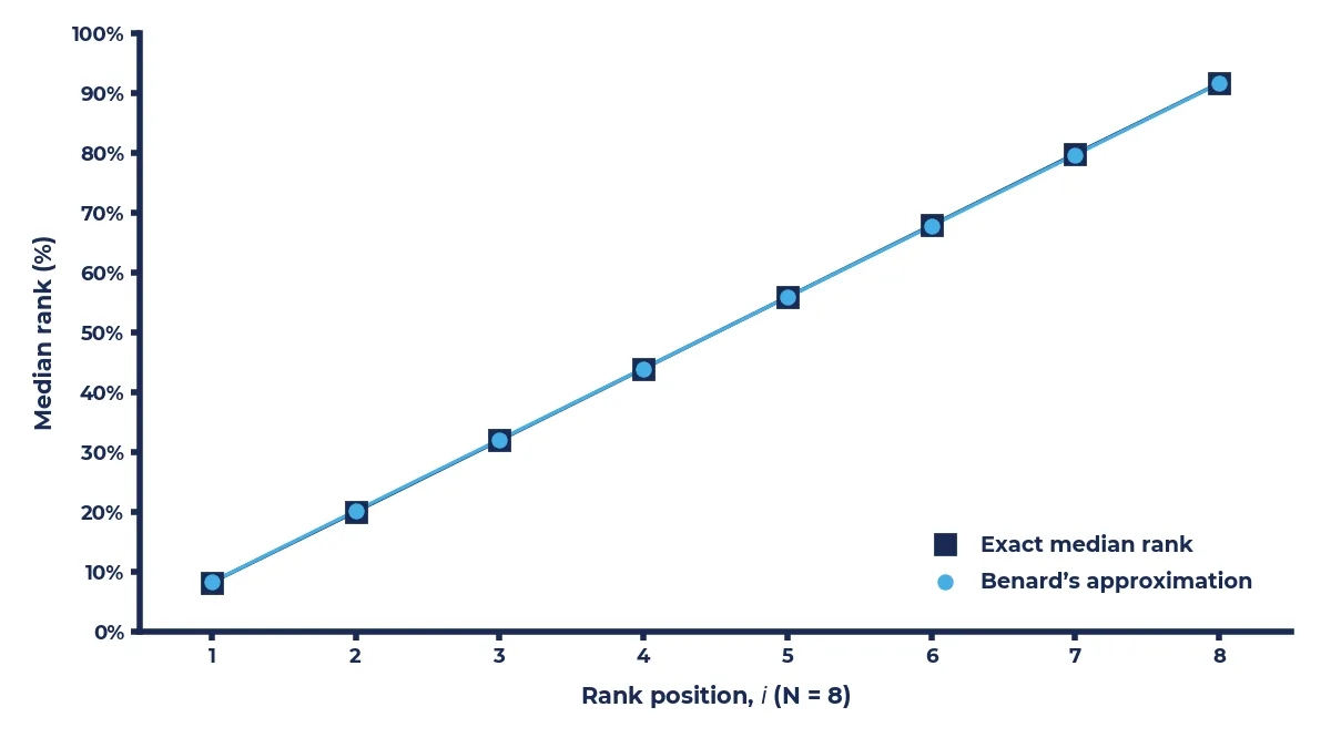
Benard's approximation is not the only route to a median rank, and it earns its place in this method on accuracy, not convenience.
The exact median rank for a given position comes from the median of a beta distribution, and evaluating it exactly needs statistical software or a very large rank table. Benard's approximation, the formula used in Step 5 above, reproduces that exact value to within about 1% for sample sizes of 5 or more, and to within 0.1% once the sample reaches 50 (Abernethy 2006). That accuracy is why this method uses a two-term formula rather than sending a reader to interpolate a printed rank table by hand: for a hand calculation or a spreadsheet, a formula correct to a fraction of a percent has no real competitor, and it scales to any sample size without a bigger table. The eleven-bushing fleet above sits comfortably inside the accurate range, and the same two-term formula holds up just as well on a fleet of 30 or 200 units, which is precisely the sample size regime most CMMS-extracted life data sets actually fall into.
Closing: One Straight Line, Fully Reproducible
Every number in the eleven-bushing table above came from three formulas, applied in a fixed order, to nothing more than raw ages and a status flag. That is the entire method: no step is hidden inside software, and no output arrives without a traceable path back to the transform in the first section of this page. Run it once by hand on a real fleet's data, and every β and η a piece of software has ever handed you becomes something you can check rather than something you simply trust.
The next page in this series turns to reading the plot itself as a diagnostic instrument: what a curve, a corner point or an unusually steep line is actually telling you about the data behind it, because a straight line like the one built here is only the beginning of what a Weibull plot can say.
If your team has a fitted β and η from software and wants a second opinion on the numbers behind them, or a data set that will not sit still on a clean line, we would be glad to work through it with you.
Start the conversation